USER EXPERIENCE OF MOBILITY APPS
using the example of "moveBW"
Bachelor thesis based on a user experience evaluation using the valence method with suggestions for improving the mobility app "moveBW". The evaluation, its analysis and results, the derivation of the suggestions for improvement, and some improved screens are presented here.

THE PROJECT
"moveBW" is the winning project in a competition organized by the Ministry of Transport of Baden-Württemberg to improve traffic and air quality in the city of Stuttgart. The project aims to create a data platform that enables a flexible combination of individual and public types of mobility. The aim is to encourage as many drivers as possible to switch to a more environmentally friendly means of transport.
THE APP
Users can access the information on the platform through an app-based mobility assistant, the mobility app "moveBW". This provides users with individual intermodal route options based on real-time data on the traffic situation and supports the change with incentives using the virtual currency of “time miles”. The present evaluation focused on the iOS version of the app.
THE GOAL
The central question of this work was whether the "moveBW" app can evoke experiences in the users, whether these are positive or negative, and which aspects of the app can trigger them. For this purpose, the user experience of the app was evaluated. Based on the evaluation results, these aspects should be further developed in a positive direction to increase the chance that the app will be used and achieve its goal.
EVALUATION
The focus of the work was on the evaluation of the app with the help of representative users. Various steps were taken to select the method, to prepare for the execution and to recruit test participants.

THE VALENCE METHOD
To evaluate the user experience of the "moveBW" app, the valence method from Burmester, M., Jäger, K., Mast, M., Peissner, M., & Sproll, S. (2010) was selected. In the first phase, the participant explores the app freely. With every positive or negative sensation, they set a valence marker by pressing a plus or minus button. In the subsequent phase of the retrospective questioning, each marker is discussed in detail.

INTERVIEWS AND ATTRAKDIFF
Before and after the valence method, interviews were conducted with the participants. In this way, their mobility and app usage behavior could be queried and final feedback on the "moveBW" app could be collected. In addition, the AttrakDiff questionnaire was used, which measures the pragmatic and hedonic quality factors that are important for the user experience.

USER GROUPS AND RECRUITMENT
The three user groups “commuters”, “leisure commuters” and “business people”, all drivers, were already specified. They should also use mobility apps and be prepared to forego driving at least occasionally. Corresponding test persons were recruited from the personal environment using a screener questionnaire.

PREPARATIONS
The app was studied to familiarize oneself with it and the areas that should be evaluated were identified. Based on the proposed procedure of the valence method, a detailed meeting timeline was set up. This formed the basis for the then created moderation guide.

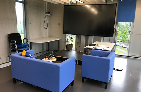
TEST ENVIRONMENT
The tests took place in the UX laboratory of the Stuttgart Media University. The laboratory consists of the test room, in which the session takes place, and the observation room, in which the technical equipment for recording can be checked.
PILOT TESTS AND IMPLEMENTATION
To train the interview technique, the operation of the recording equipment, and the timeline of the meetings, three pilot tests were completed. The actual valence method sessions were successfully conducted and recorded with the twelve participants on three consecutive days.
ANALYSIS AND RESULTS
In order to evaluate the interviews, the answers were noted down in key words based on the video recording. The AttrakDiff was automatically evaluated in the online tool through diagrams.
To evaluate the valence method, all retrospective phases were transcribed verbatim and all valence markers were entered in a table, which was then consolidated. The qualitative and quantitative evaluation was carried out on the basis of this. The results of these are presented below:

THE PARTICIPANTS
All three user groups could be covered by the twelve participants. The high number of students and thus the high number of 21 to 24-year-olds is due to the recruitment of participants from the personal environment.

ATTRAKDIFF
The evaluation of the AttrakDiff shows that both the pragmatic and the hedonic quality of the app are perceived as neutral to positive. There is therefore room for improvement in both areas.

QUANTITATIVE ANALYSIS
For the quantitative evaluation, the corresponding values were calculated using formulas of the valence method. These show that the user experience of the "moveBW" app is neutral. Different design elements, system properties and experiences of the participants varied between negative, neutral and positive user experience.

QUALITATIVE ANALYSIS
For the qualitative evaluation, clusters of related design elements were formed in the table and the twelve groups with the most markers were selected. These were evaluated in detail on the basis of the associated markers and statements, with the focus being on positive meanings of the element.
INTERVIEWS
The evaluation of the interviews produced interesting insights into different topics as well as initial feedback on the "moveBW" app. In addition, it made it easier to classify the statements of the participants during the valence method.
USABILITY PROBLEMS
While filling out the evaluation table, notes on usability problems from the retrospective survey were noted in parallel. These were clustered so that usability problems of the app could be identified as a by-product of the valence method.
SUGGESTIONS FOR IMPROVEMENT
Based on the results of the user experience evaluation concrete improvement suggestions for the "moveBW" app were derived. For this methods from IDEO's “The Field Guide to Human-Centered Design” were used. The detailed procedure is described below:

"DOWNLOAD YOUR LEARNINGS"
In order to get an overview of all the results of the preliminary and follow-up questionnaires, the AttrakDiff and the valence method, they were noted down on post-its and arranged on a wall. The first overarching results were noted below.

"FIND THEMES"
Overarching findings from the previously generated post-it wall were transferred to new post-its on another wall and clustered into seven topic blocks in order to obtain an overview of the central results. These topic blocks contain factors that could trigger positive emotions in the participants when using the moveBW app.

INSIGHTS
For each topic block several insights were created , which summarize the message of the topic block in several sentences. Each insight was ensured to be based on the results of the evaluation.

"HOW MIGHT WE" QUESTIONS AND IDEATION
Based on each insight a “How Might We” question was formulated. Brainstorming was carried out on each question. The results were clustered on a wall with post-its and assigned to existing or new screens of the app.

FROM THE IDEA ONTO THE SCREEN
In order to further visualize the ideas, smaller versions of the post-its were first attached to printouts from existing screens, which resulted in further ideas.

ITERATIONS
Then, in a further iteration of the suggestions, the ideas were sketched directly in the printouts in order to further flesh out and visualize them. The recommendations from the noted usability problems were also integrated.

STORY SCENARIO
Then a kind of "story scenario" was designed in which the fictional user David Müller from Steckfeld uses the "moveBW" app for the first time to navigate to his girlfriend Jule. In this way, an act could be generated that clarifies the form and interactions of the product and at the same time shows David's experience on the user experience level.

REALISATION AS SCREENS
A paper prototype was sketched from the individual screens of the scenario, for which feedback was obtained from a UX expert. The feedback was incorporated and the screens then graphically implemented in Sketch. The finished digital screens were shown again to a UX expert for feedback, whereupon further small adjustments were made.
IMPROVED SCREENS
Below some improved screens from the scenario are presented. These are partly based on existing screens and are all based on the design of the "moveBW" app.

ONBOARDING
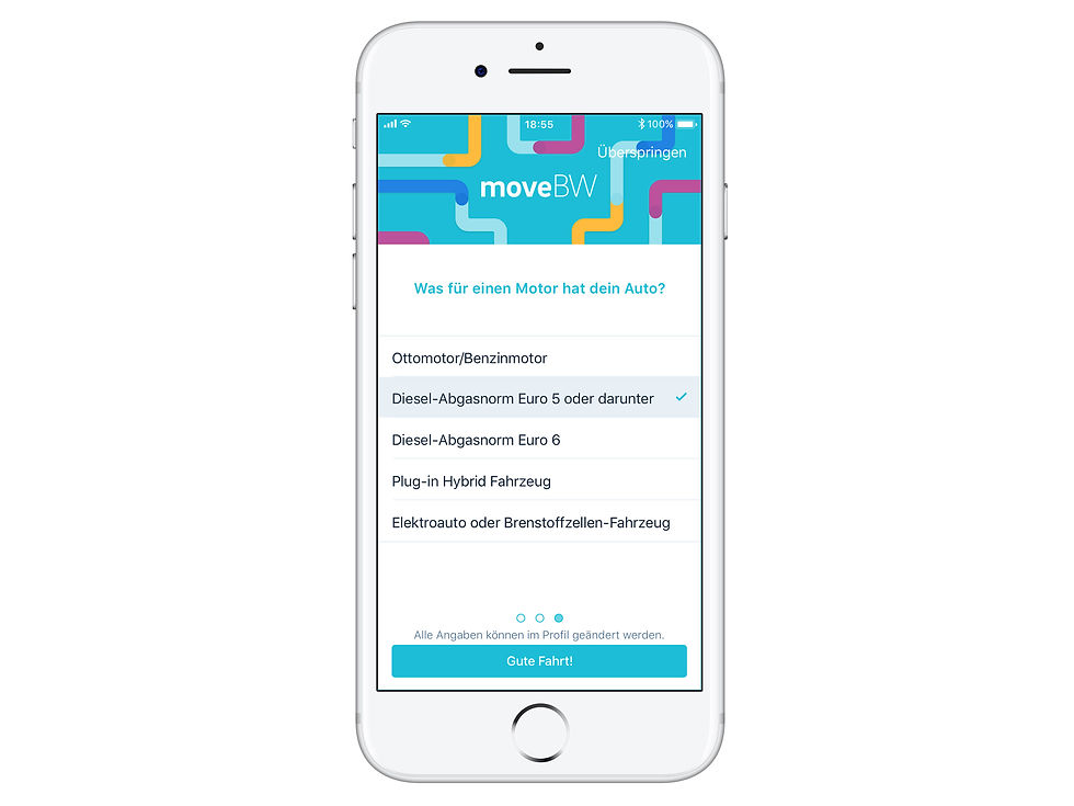
An onboarding was designed for the app to explain the basic functionalities of the app to the user. The aim is to keep the user's attention through illustrations and parallax animations. Previously, test participants were confused about some features and the "Zeitmeilen" because they was no explanation in the app.
PERSONALIZATION
Users now have the option to provide information so that the app can make personalized routes and data available to them. This enables them to find suitable routes more quickly and to be informed of important messages such as driving restrictions. Test participants previously showed doubts about the relevance and background of data.


ROUTE SEARCH
The search mask has been optimized to enable the user to search as quickly as possible with just a few clicks. The "Favorites" function has been supplemented by a "Personalization" function. Previously test participants could not find some functionalities of the search mask or were confused by cumbersome entries.


NAVIGATION
The navigation and its directions confused many test participants. Therefore they have been revised in order to better inform the user and provide orientation. In this way they can be sure of their route, regardless of whether they are on foot, go by car or by public transport.


MONITORING
The monitoring has been supplemented by a map view and more detailed traffic disruption reports so that the user can also incorporate his own route knowledge. Test participants were confused by more general messages and their unclear effects within the app.


"ZEITMEILEN"
The "Zeitmeilen" ("time miles") are now explained to the user during onboarding. In addition, clear feedback on earning "Zeitmeilen" was designed. Additionally a screen shows the user an overview of what they have achieved so far and explains the meaning of the "Zeitmeilen" again. Test participants were at a loss as to what the leaf icons should mean.


Date May - July 2018
Work by Ellen Schmucker
Thesis to obtain a Bachelor of Arts Information Design studies, Stuttgart Media University
Tools Sketch, Atomic.io
Methods user experience evaluation, user research, screener, moderation guide, user group definition, pilot tests, valence method, AttrakDiff, PANAS, sociodemographic questionnaire, interview, transcription, qualitative and quantitative evaluation, cluster, consolidation, usability problems, insights, "How might we?" questions, ideation, screen sketching, story scenarios, paper prototypes, mockups, interactive prototypes